Category: Assignment #4

  • Question #1

    Visuals are not decoration. They are communication tools. Provide three strategic reasons why visuals are essential to effective web content. For each reason:

    • Clearly explain the concept

    • Provide a real-world example (not generic statements)

    Marks are awarded for depth, not surface-level answers. (6 Marks)

    Three strategic reasons why visuals are crucial and are effective for website content is because visuals improve comprehension, transmit information quicker, and increase engagement. As discussed in class and shown through the powerpoints, people are able to effectively process images quicker over written text. In fact, visuals have been found to improve learning by up to 400% percent (Briscoe , The Power of Visuals – W26, slide 12). Visuals allow people to quickly comprehend and understand material without having to read large paragraphs. Visuals allow a sense of organization and communicate ideas more effectively, with 40% of people responding better to visual information than written text (Briscoe , The Power of Visuals – (W26), slide 4,13). A real world example that shows how visuals are effective is Spotify Wrap. Spotify has a feature where they track your most played songs and most liked artists in a year. Instead of collecting this data and presenting it in a written format, Spotify uses colorful graphics to show personalized graphs and creative imagery to communicate an individual’s favorite artist of the year, most played song of the year, and listening time with many people sharing their results on social media platforms like instagram. Not only does Spotify collect data effectively, but they also collect data and present it in a more creative and engaging way. 

    In addition to visuals improving comprehension, visuals also allow web users to transmit information quicker. Visuals play a crucial role not only for web content but for day to day life. With 65% of the population considered to be visual learners (Briscoe , The Power of Visuals – (W26), slide 5). Visuals transmit messages faster as the human brain processes visuals 60,000 times faster than written content (Briscoe , The Power of Visuals – (W26), slide 9). This is crucial for website content because users often scan through pages for less than a few seconds and are fast to leave a website if their needs haven’t been met and have to read large portions of written content. A real world example that uses visuals for transmitting information quicker are hotel websites like Expedia. Expedia uses images of different hotel rooms, with images that display what the room offers. Rather than reading long descriptions, people who are looking to book a hotel for a vacation  are able to quickly scroll through these images and find and book a hotel that meets their needs and expectations. 

    My last strategic reason on why visuals are crucial and effective for website content is that it increases user engagement. Visuals are more appealing to web users and draw viewer attention rather than long descriptive paragraphs. With users forming  impressions of websites in just 50 milliseconds (Briscoe , The Power of Visuals in Web Content – (W26), slide 2). Strong visuals not only draw attention, but also encourages web users to interact with your website by remaining on the website’s page and sharing a website with others. In fact, visual content is 40 times more likely to be shared on social media platforms (Briscoe, The Power of Visuals in Web Content – (W26), slide 3). A real world example that demonstrates how visuals boost user engagement is Amazon. Amazon utilizes visual images of their many products with zooming features that allows web users to see a product in different angles. Amazon does a good job engaging users and makes it simple for them to share their favorite products. Overall, Amazon is a good example of a website that utilizes images that keep web users interested and makes a user more likely to make a purchase. 
  • Question #2

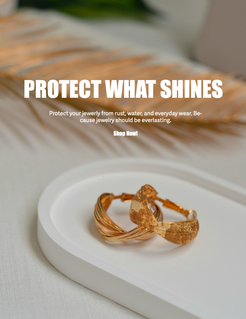
    This is a multi-part question. Please create a visual post for your blog on a topic specific to your business and answer the questions below. You will create a visual-first blog post for your business website. This involves critical thinking. What is important to your business and visitors? This is not a written article with an image added. This must be:

    • Image-led

    • Message-driven

    • Minimal text

    • Strategically intentional

    The image(s) must carry the meaning. You may use:

    • Photography

    • Original graphics

    • Screenshots

    • Edited visuals

    • Multi-image carousel format

    • Before/after comparison

    • Visual storytelling sequence

    • Etc.

    The key requirement – If the text was removed, the visual would still communicate the core message.Please pay attention to what was discussed in class. Ensure that you include a link to the blog post in your answer. Do not forget that this needs to be included in your hardcopy. I am marking what you hand in with your hardcopy but also need to see the digital version on your blog. If it is not online for me to view (in addition to the hardcopy), I cannot mark this question. (4 Marks)

    You must:

    • Include the visual post in your hardcopy.

    • Publish the post on your blog under a category titled “Assignment 4”

    • Include the direct URL in your hardcopy

    • Ensure your blog navigation is working and accessible

    Designed with Indesign Adobe and Photoshop Adobe

  • Question #2 a

    Why did you choose the specific image(s)?

    Your explanation must include:

    a) Business relevance

    b) Target audience alignment

    c) Image intent

    d) Why this visual works better than alternative visual approaches

    I chose this specific image and used the help of photoshop and indesign to make it relevant to my business’s objective and goal of preventing rusting and tarnishing of affordable gold plated jewelry. My business, Everlast Jewels, focuses on creating a solution that limits jewelry from rusting from any form of water exposure permanently. By showcasing gold plated earrings, one which is shiny and new and one that is rusted and dull looking side by side represents a common issue in the fine jewelry industry, and how my product solves it. This visual for my blog effectively communicates and resonates with my target audience, specifically those who are all time jewelry lovers who wear jewelry daily and seek affordability and durability. This visual relates and aligns with my target audience because it’s a common experience, where jewelry rusts over a short period of time, making the visual seem relatable and addresses a common issue seen in the jewelry industry. The image intent is used to create contrast, similarly to create a before and after approach to what protected and non-protected jewelry looks like. By showcasing both shiny and rusted gold plated earrings, it makes viewers understand and relate to the common issue without having to read the text fully. Personally speaking, I feel that this visual concept works better then other visual approaches because it effectively showcases and communicates the common issue and an ideal solution. I felt that a single product image wouldn’t effectively communicate the industry’s issue and a lifestyle image wouldn’t be as direct. Therefore, I came up with a before and after/ side by side  concept that makes it more effective by showcasing both at the same time, making viewers grab the concept faster.

  • Question #2 b

    Explain in detail how the image(s) strengthens the post from a digital marketing perspective.

    You may reference:

    • Attention economy

    • Scroll behavior

    • Visual hierarchy

    • Brand perception

    • Trust building

    • Emotional triggers

    • Information processing

    • Conversion influence

    Be analytical. This is not a design reflection. This is marketing reasoning.

    The image strengthens the post from a digital marketing perspective by capturing the attention of viewers quickly and communicates a common issue in the jewelry industry. When it comes to web content, visuals are processed 60,000 times faster than written text (Briscoe , The Power of Visuals in WebContent – (W26), slide 2). Large written portions are often ignored and scolded passed, which is why its crucial visuals capture an audience’s attention instantly. The side by side/ before and after visual showcases one shiny earring and one rusted one catching the attention of jewelry lovers and a common issue faced in the jewelry industry, making them immediately interested in the post. In addition, the visual image also showcases visual hierarchy . At first glance, the viewer notices a pair of gold earrings and the contrast between the quality of earrings. Where one is shiny and one is rusting, along with supporting text and heading. Additionally, the visual image utilizes one of the 6 principles of design, emphasis (Briscoe,W9- The Power of Visual Content- (W26), slide 45). By making one earring rusted and dull, it draws the attention of viewers, while also being relatable. The visual allows the audience to better understand the concept and objective of my business while also making it more eye-catching and simple to comprehend. The visual image also captures brand precipitation and trust. Showcasing the issue of jewelry rusting visually, and the desire of long lasting and protected jewelry. The visual blog post is meant to directly reach customers and offer a solution. Building a sense of trust, and becoming  more meaningful rather than just a promotional blog post. As mentioned in the powerpoints, words and images combined are 5 times more memorable then words alone (Briscoe,W9- Enhancing Content – (W26), slide 41). The visual along with the short written text makes the brand feel more thoughtful and reliable. Another key aspect of how my blog visually connects to a digital and marketing perspective is through the use of emotional triggers. Visuals cause a stronger and faster reaction than words alone (Briscoe,W9 – C- Importance of Visuals – (W26), slide 15). Jewelry can be personal and significant value financially. Therefore, seeing rusted jewelry can often trigger a feeling of sadness or irritation. On the contrary, a shiny earring creates a feeling of reassurance, making viewers feel a sense of trust and reliability. The image creates a strong message and provides a desirable solution. Lastly, the visual also encourages conversion influence because it explains and shows the product’s benefits in one visual. Viewers are able to connect with the product and its benefits through the contrast of shiny and rusted earrings. Increasing the likelihood of viewers to engage in a post and proceed to purchasing it. Especially if they feel that a product meets their specific needs. Overall, the visual I created with the help of Photoshop and inDesign better strengthens my blog post from a digital marketing perspective by making the message clear and direct, faster to comprehend, memorable, and persuasive.

  • Question #3

    Visit the St. Clair College website. Analyze it strictly from a visual marketing strategy perspective targeting: Local domestic high school students.

    You are to provide three strategic visual enhancement recommendations. For each recommendation:

    1. Clearly identify the issue or missed opportunity (3 x 2 = 6 Marks)
    2. Propose a specific visual improvement (3 x 2 = 6 Marks)
    3. Explain why it would improve recruitment effectiveness (3 x 2 = 6 Marks)
    4. Connect it to student psychology and digital behaviour (3 x 2 = 6 Marks)

    When it comes to St.Clair’s visual marketing strategy perspective, The St.Clair College Website home page utilizes a lot of images and offers news detailed information for college students, but they lack a clear message and is overall overwhelming with the use of  drop down options, text boxes and sliders, and website transitions, making it difficult for domestic high school students to find their way around the website. For my first recommendation, a visual improvement that can be proposed is instead of having multiple images with transitions and repetitive internal links, offer a more simple layout, utilizing a more balanced layout rather than having multiple directories . A simple but strong call to action like “Book a Tour” or “Get Started”  would also be beneficial for domestic students to get to know the classes and campus. This would improve recruitment effectiveness because reducing the amount of images and visuals causes less confusion and makes it easier for students to navigate though the St.Clair Website and encourages students to explore what St.Clair has to offer. Connecting through a student’s psychology and digital behavior point of view, High school students have a lack of attention span and only spend a few minutes on a website deciding whether or not a College or University is the right fit for them. High School students want a simple and easy to understand layout when it comes to applying to college as the majority of high school students are nervous for the new transition. Therefore, by creating a more simple layout and limiting any repetitive internal links, St.Clair College would increase engagement numbers on their site and provide a more useful and less overwhelming experience to domestic students. A second recommendation I would suggest for St.Clair Website involves the program options and facilities. From the home page, students are able to explore the full time programs at St.Clair College and explore a list of programs and facilities St.Clair has to offer. When recalling my first year in College, the St.Clair website lacked emotional visuals and story telling aspects. Although there are strong informational videos, it lacks student centred visuals which  demonstrates real time events, clubs, visual  testimonials,etc. These aspects would create a strong relatable and personal feel to students building a sense of trust. By doing so, St.Clair College can improve its recruitment effectiveness, proving real time experiences becoming more appealing to first year college students. Limiting any uncertainty and concerns and encouraging students to apply to St.Clair College rather than other Universities and Colleges in Ontario. From a student’s psychology and digital behavior, emotional connection is a crucial factor. First year college students are influenced by peer experiences and are more likely to apply to a college they trust. Students value real time experiences though visuals that are direct and clear. This creates a sense of belonging and identity. Lastly, St.Clair offers important and valuable information other than programs such as financial aid, campus clubs and opportunities. However, the website does not visually display these features effectively. Similarly to recommendation one, the information is scarred across the website which is confusing and harder to navigate to. A well structured and organized layout can allow students to quickly navigate to important information, improving user experience as a whole. This can be achieved though limited text and strong short headings, icons, and visuals. Making St.Clair’s website is more visually appealing and easy to click though, encouraging  students to continue scrolling and engaging with content, improving recruitment effectiveness overall. High school students usually don’t read a website’s content fully and quickly glance through sections missing out on important and valuable information. With a strong visual hierarchy, students are able to navigate through St.Clair’s website and find important information quickly and limit any confusion and stress they might be feeling already.